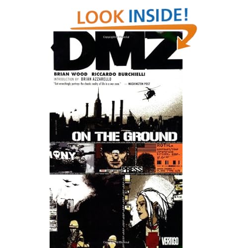
DMZ Vol. 1 - On The Ground
By Brian Wood, Riccardo Burchielli
You know when all the parts of a machine look great, but when you put them together something just doesn't click? For me that was the first volume of Brian Wood's cult favorite DMZ . I think I was supposed to like this more than I did.
After all, what’s not to like? The premise is right up my alley. America at war with itself. New York an island in the midst of the war. The survivors, isolated in the city, have hacked out bits and pieces of a society – though anarchy all too often still reigns supreme. A young journalist is in the middle of it all, documenting the war in the midst of New York City and what that conflict is doing to the civilians there.
That's the stuff right there, folks. Exactly the sort of thing I’d like to read. So why did the first volume leave me wondering if I wanted to keep reading?
Because it failed to deliver on all that promise.
For all the praise Wood gets for this supposed love letter to New York City, I rarely got the sense of place I should have felt. One should be immersed in the city, living it and breathing it and feeling it, yet that sense of being there was inconsistent. When they nail it, they nail it – but they don’t always nail it. That's a pretty huge failing for a series of this type, seeing as it leans so heavily on location.
Maybe it’s the art. Riccardo Burchielli’s style does not appeal to me, but that’s something I can live with (even if all the characters are as ugly as sin). What I can’t live with is rough storytelling. Burchielli draws a great cityscape, but his panel-to-panel work just isn’t as clear and direct as it should be. It’s not that I felt lost, it’s just that it’s very, very uneven; a spotty sense of composition, totally arbitrary use of unusual angles, and so on. A case of style over substance doing the story a disservice.
It doesn’t help that the coloring is so damn muddy. Everything is washed out in a murky reddish hue, so few things really pop from the page. I understand the color choices and why they were made, but this book really could have used more contrast in that regard. Even if you want a bleak, war-torn near future, in order for it to really have impact you've got to have something cleaner to set next to it. Maybe this is why the issue set in Central Park during the winter looked best. It offered an excellent contract with the overall look of the series.
So what we're left with is the writing carrying the load. Well, it does what it needs to do, but not much more. Wood’s writing was fine. Not extraordinary, a bit problematic here and there, at times very good, but overall it didn’t grab my bag. Quick dialogue and an attempt at a "hip" and "edgy" tone that doesn't always ring true.
I’m hoping this stuff improves, because there is a lot of potential in the premise of this series.
Which is what it boils down to for me. The premise. The single strongest thing about this book, and the one thing that will get me to read the second volume.
An earlier version of this review was originally posted at IMWAN.com and was also featured at Popthought.com.
Read my regular, everything-and-anything (usually on writing and music) blog right over here.


No comments:
Post a Comment